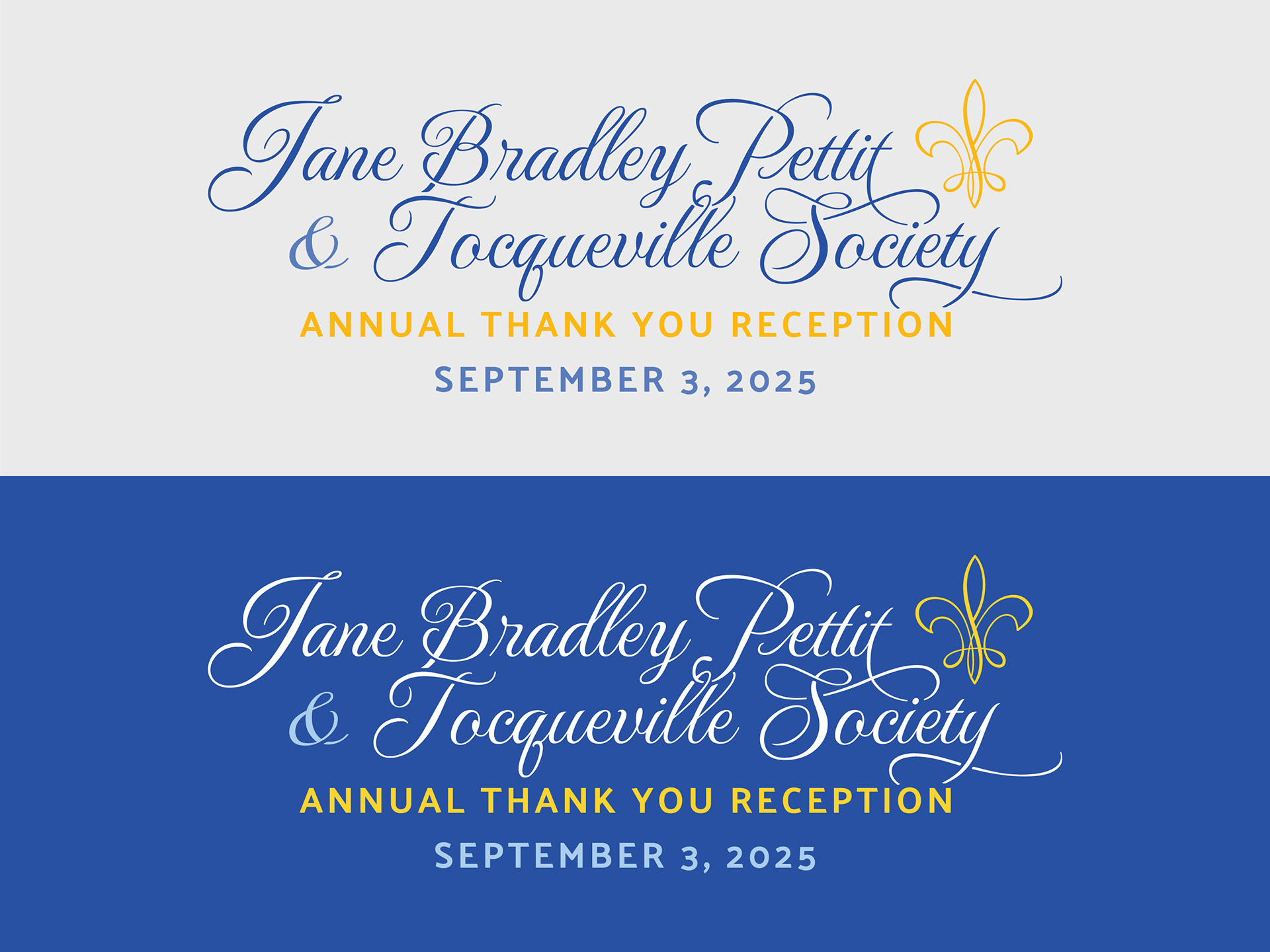
The United Way Tocqueville Society is a global network of philanthropic leaders, with Milwaukee & Waukesha County having its own specific chapter. For this project, a visual identity was needed that represented both the global and local aspects of the organization, primarily used for their annual reception where the two groups come together to celebrate and network.
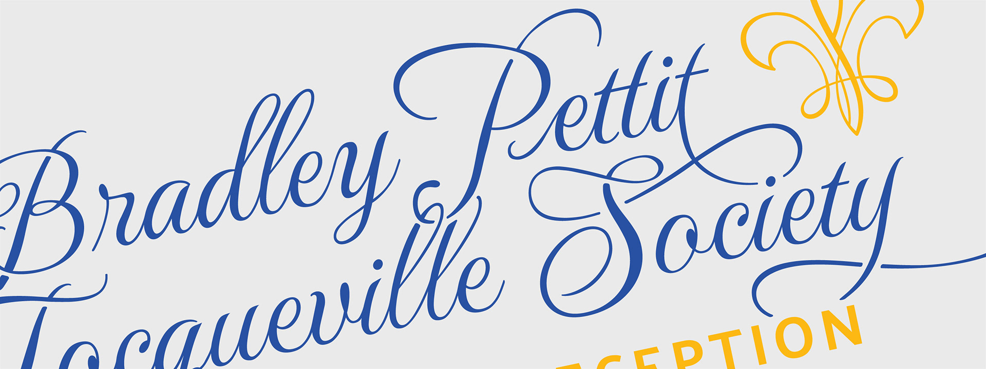
The goal of the design was to symbolize the merging of these two groups. This was achieved through the fluidity of the ascenders and descenders in the letterforms. A key challenge was incorporating United Way’s new script typeface while maintaining harmony with their bold, well-established all-caps sans-serif typeface. Additionally, the inclusion of the fleur-de-lis ties the design to United Way’s global branding for the Tocqueville Society donor network.
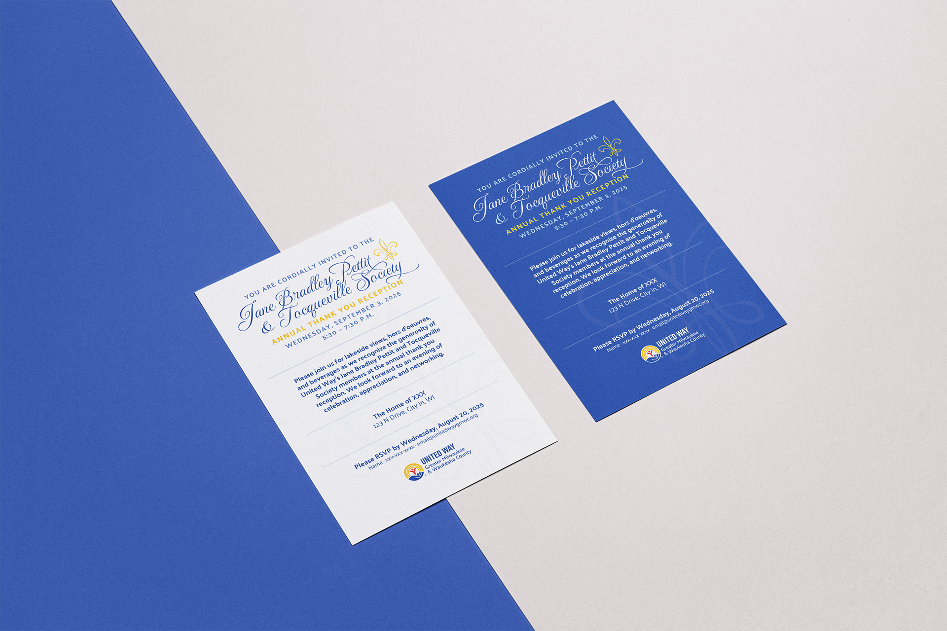
The design would have only a few applications, primarily as a header for a printed invite (pictured below) for the reception, and email header graphic. Therefore, there was no concern over the "logo" not scaling well as normal logos should, given the thin weight of the typeface.
The theme of the parties has always been elegant and upscale, yet warm and inviting. Given the script font used for the typeface doing a lot of the heavy lifting, the decision was made to keep the rest of the printed invitation simple and minimalistic.
Two variations of a printed invitation were created for mailing and distribution to invitees.