A local nonprofit reached out in need of a logo and brand identity. This nonprofit formed in the wake of a devastating tragedy that deeply impacted the community and resonated globally. This organization was established as a resource center to support individuals affected physically, mentally, and emotionally by the event.
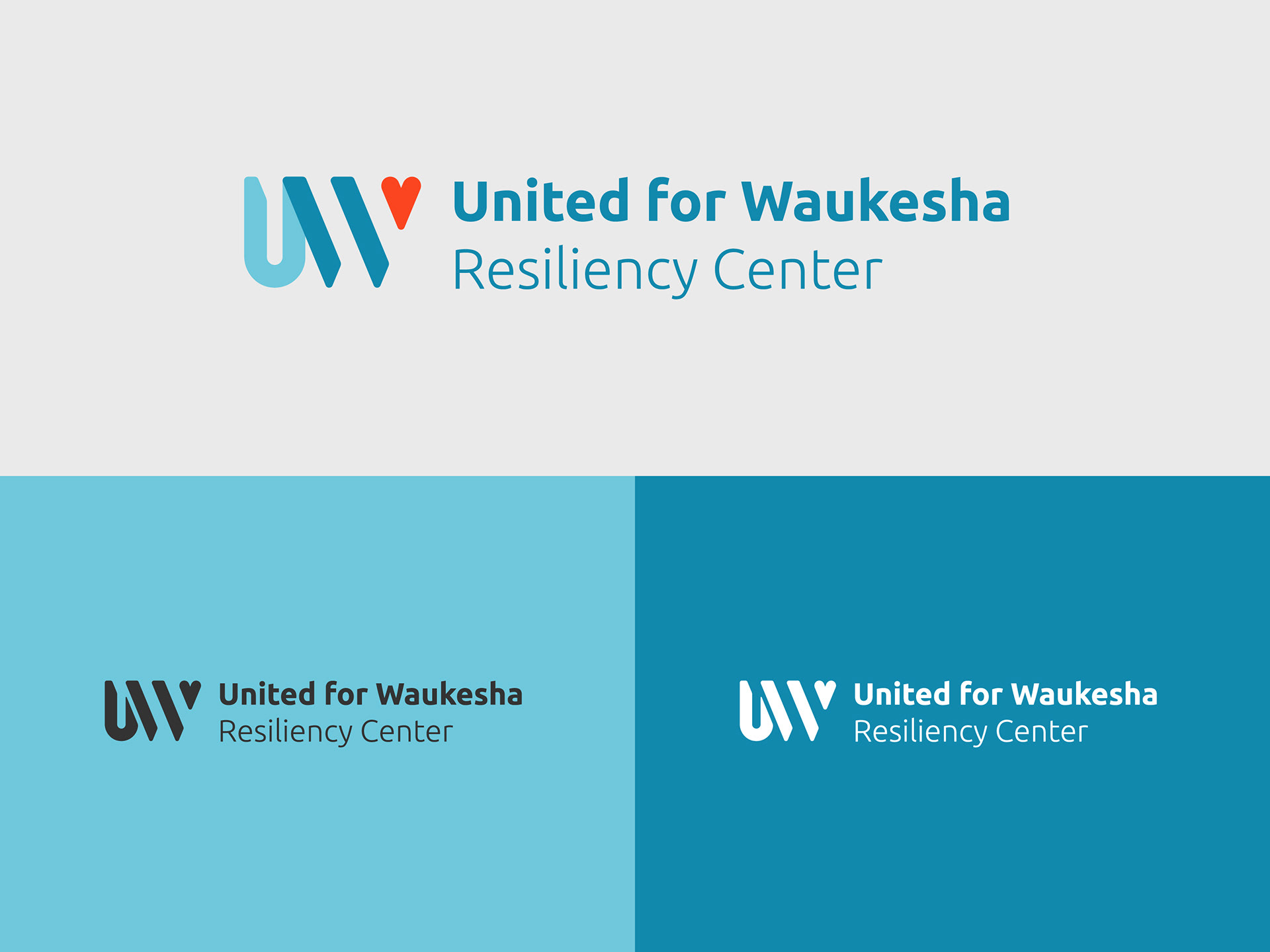
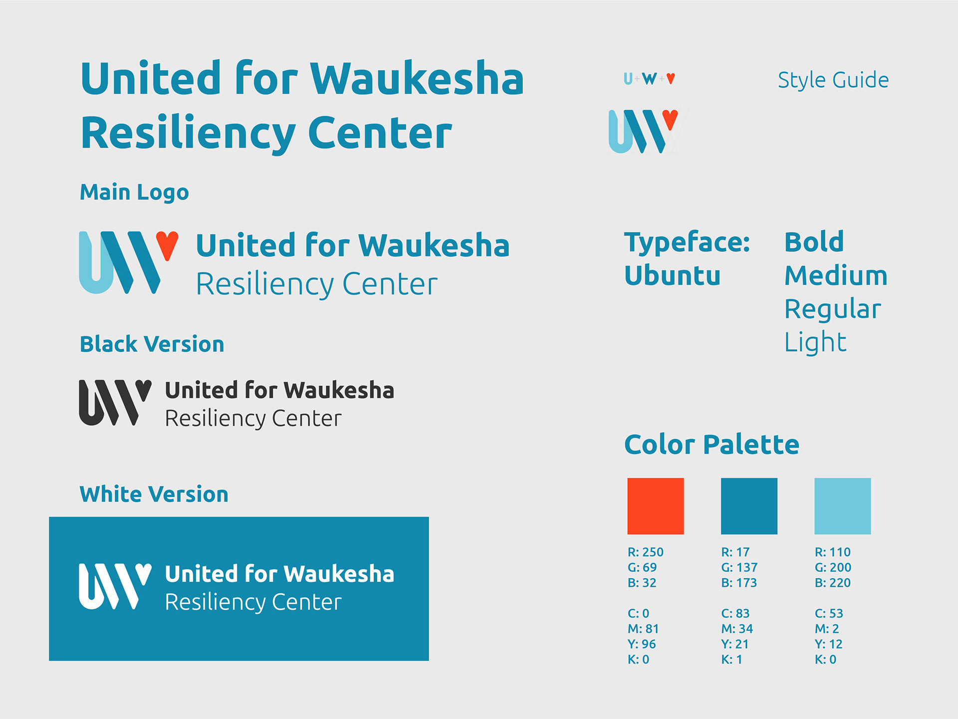
The logo needed to embody themes of togetherness, love, and compassion, while incorporating the city of Waukesha’s signature blue and red colors. It was crucial that the logo’s elements flowed together cohesively. The U + W wordmark had to stand out in a crowded landscape of similar logos used by universities and banks throughout the state. To achieve this, distinct shades of blue and a heart symbol were incorporated, which the latter was a direct request.
The typeface was selected to be calming, fluid, yet bold, with multiple weights to allow flexibility due to the length of the name.
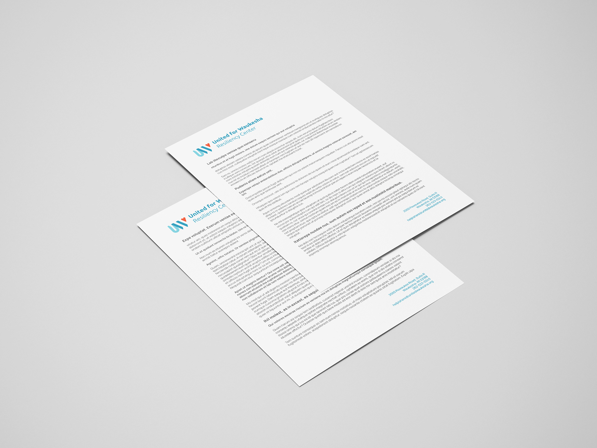
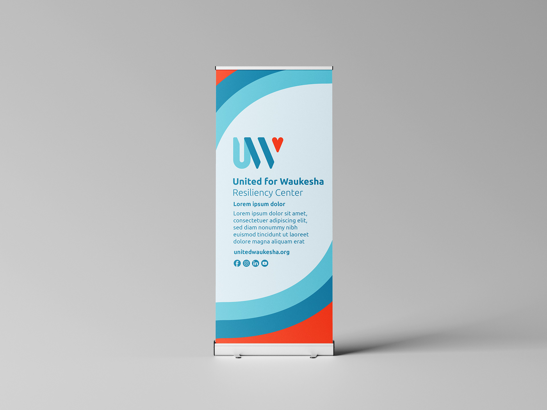
Once the logo and identity were finalized, templates were created for letterheads, and mockups for pull-up banners were presented to showcase the brand’s versatility in various formats.