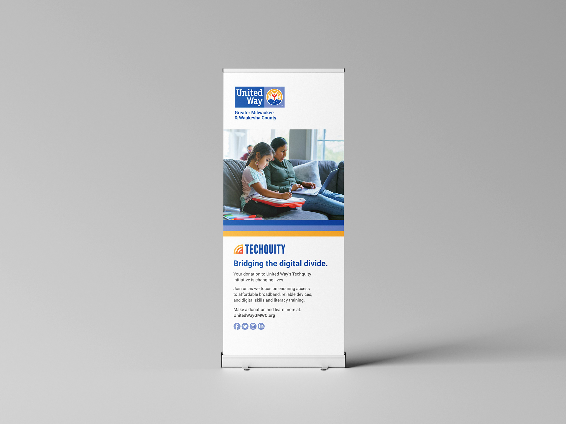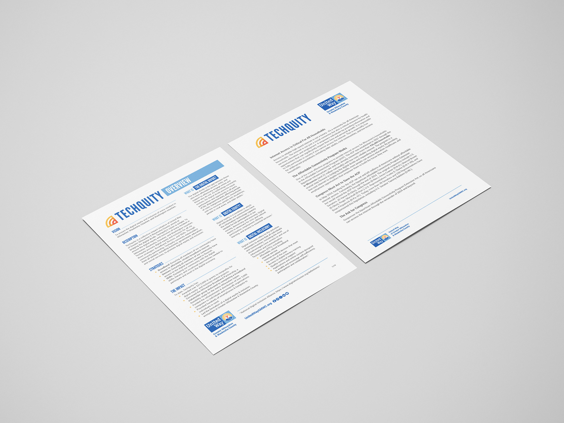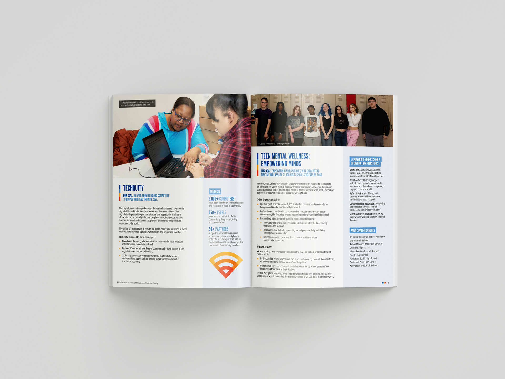
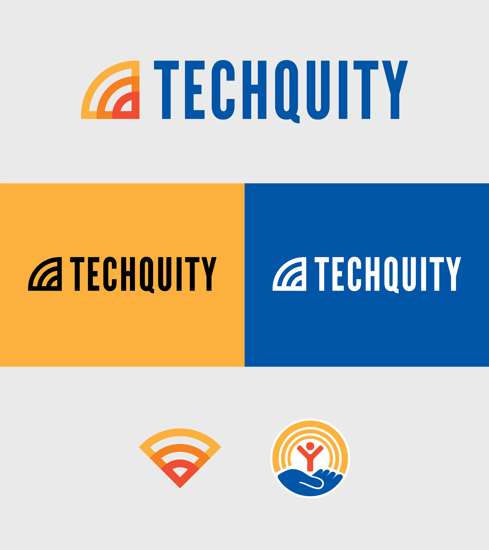
Techquity was a program launched by United Way of Greater Milwaukee & Waukesha County at the start of the pandemic, aimed at ensuring digital equity and inclusion for the community during a time when internet access became essential for basic needs. The initiative needed a logo that would align with the United Way's brand while representing Techquity's mission.
To maintain brand consistency, it was important to use the same brand typeface and design a symbol that would complement United Way's existing iconography. Originally focused on providing affordable broadband internet access, Techquity's scope expanded to encompass much more. A Wi-Fi symbol was incorporated into the logo to represent this, and used a gradient color scheme reminiscent of a sunrise, symbolizing hope and positivity. This design, with its seamless integration of United Way's colors and font, ensured the logo felt like a natural extension of the brand.
The logo has been featured on a variety of materials, including brochures, table tents, newspaper ads, banners, and more.
Here's a simple, condensed animation to give movement to the logo that was used as an intro and outro for videos created to support the annual fundraising campaign.