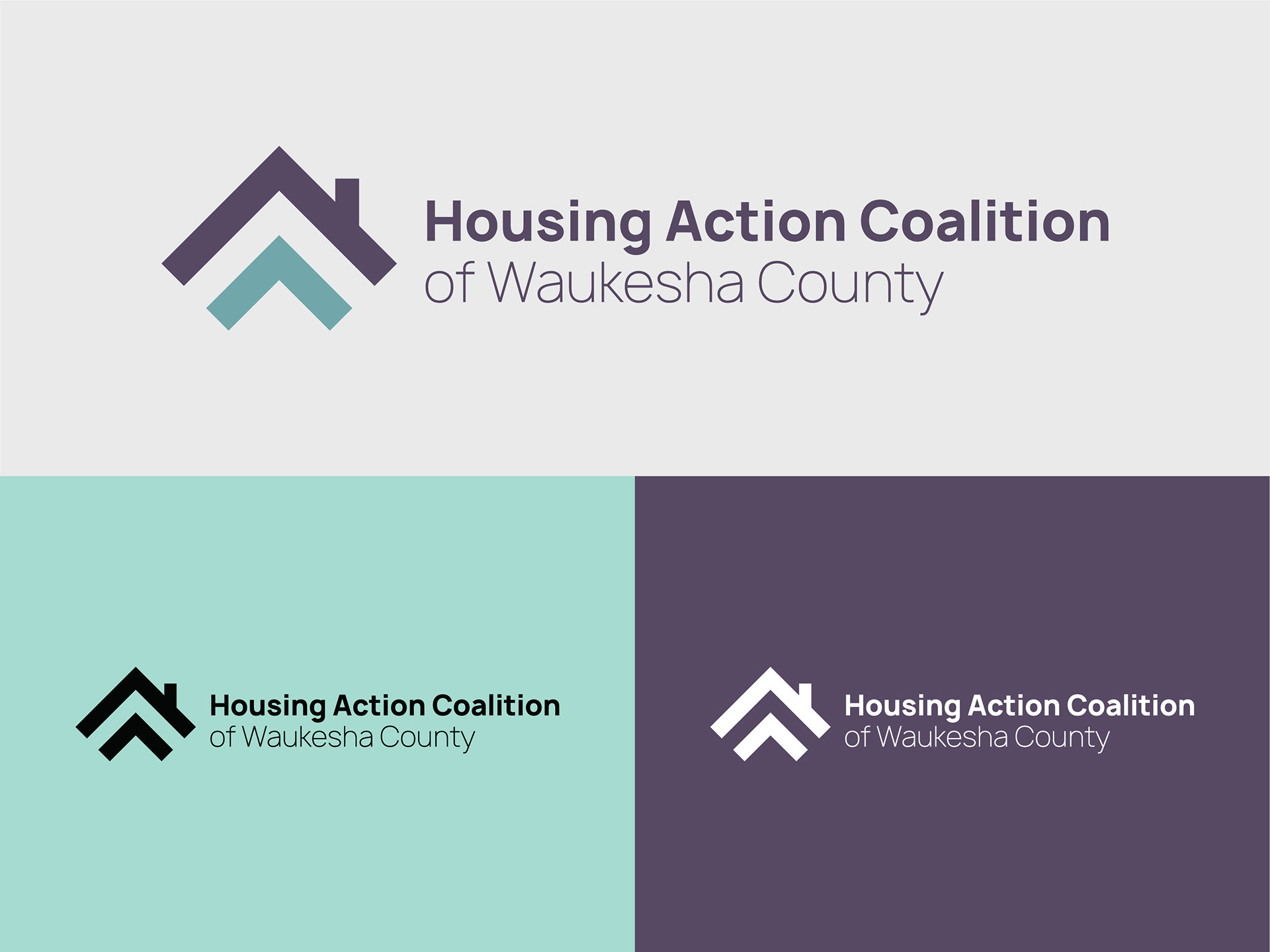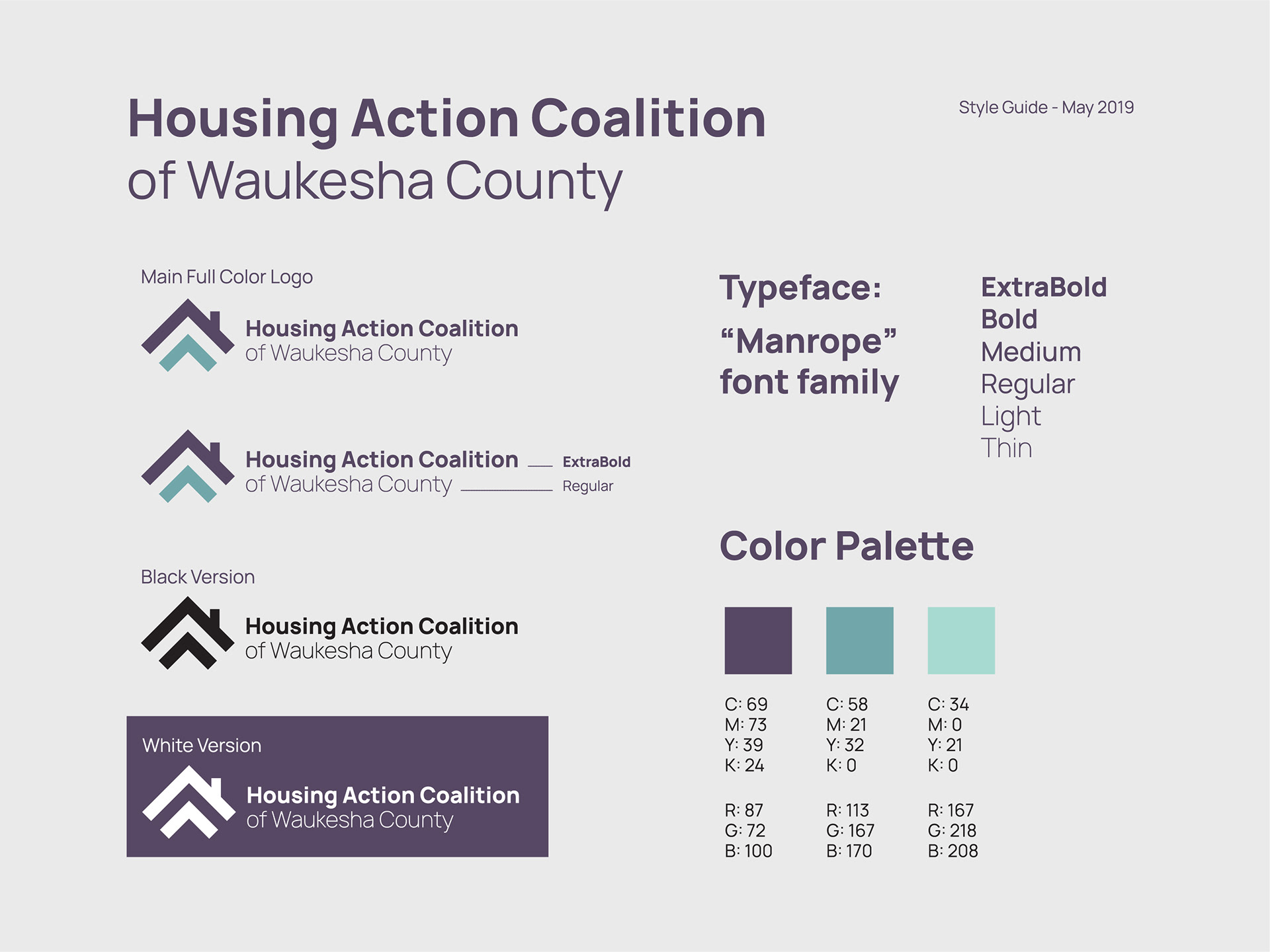
A newly established nonprofit needed a logo and brand identity for their housing assistance program. They requested a professional and clean logo that included a house element. The logo mark needed to convey both professionalism and optimism, given the program's mission to help individuals find housing.
Using a literal approach, a house silhouette was included that subtly resembles an upward arrow, symbolizing hope and progress. To further emphasize movement and community, an additional arrow shape was incorporated, which also allowed more of a canvas to include more color into the design. This dual arrow element evokes a sense of unity, reflecting the supportive nature of the program.
The color palette combines a bold dark purple, lending strength and presence to the logo, with a softer blue-green to evoke calmness and trust.
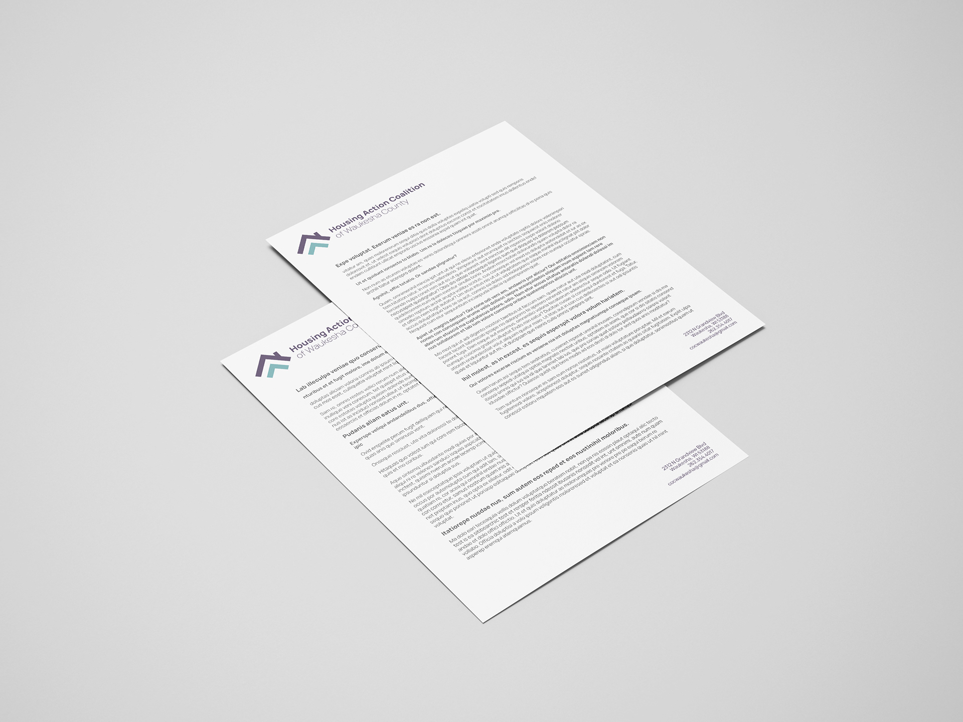
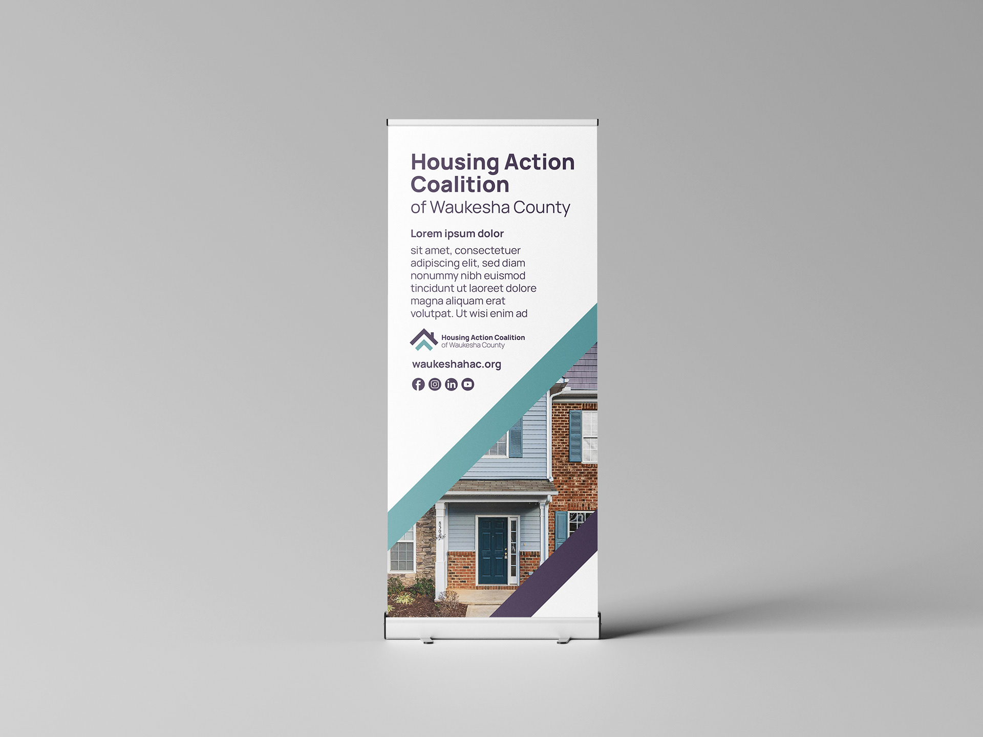
In addition to the logo, letterhead templates were developed, and designs for potential pull-up banners were created for use at resource fairs.